
We’re thrilled to unveil our latest spice label designs for a potential client in Pretoria. These labels are crafted with precision and creativity, ensuring they stand out on both sealable packaging and spice jars. Each design is print-ready, reflecting a perfect blend of functionality and aesthetics.
1. Chicken Spice Label Design
Our Chicken Spice label is designed to evoke the rich, savory flavors that this spice blend brings to your dishes. The label features a warm, earthy color palette with hints of red and brown, symbolizing the hearty and robust nature of chicken seasoning. The typography is bold yet elegant, ensuring the label is easily readable while adding a touch of sophistication.
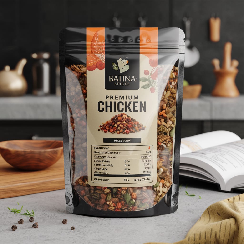
The design process for the Chicken Spice label began with understanding the essence of the spice itself. Chicken spice is often associated with comfort food, hearty meals, and family gatherings. We wanted the label to reflect these sentiments. The warm colors were chosen to evoke a sense of warmth and coziness, while the bold typography ensures that the label stands out on the shelf.
We also incorporated subtle graphic elements that hint at the ingredients used in the spice blend. Small illustrations of herbs and spices are woven into the background, adding depth and interest to the design without overwhelming the main text. This attention to detail ensures that the label is not only visually appealing but also informative.
In terms of functionality, the label is designed to be easily readable from a distance. This is crucial for products that are often stored on high shelves or in crowded pantries. The bold font and clear layout ensure that the product name and key information are immediately visible, making it easy for consumers to find what they need.
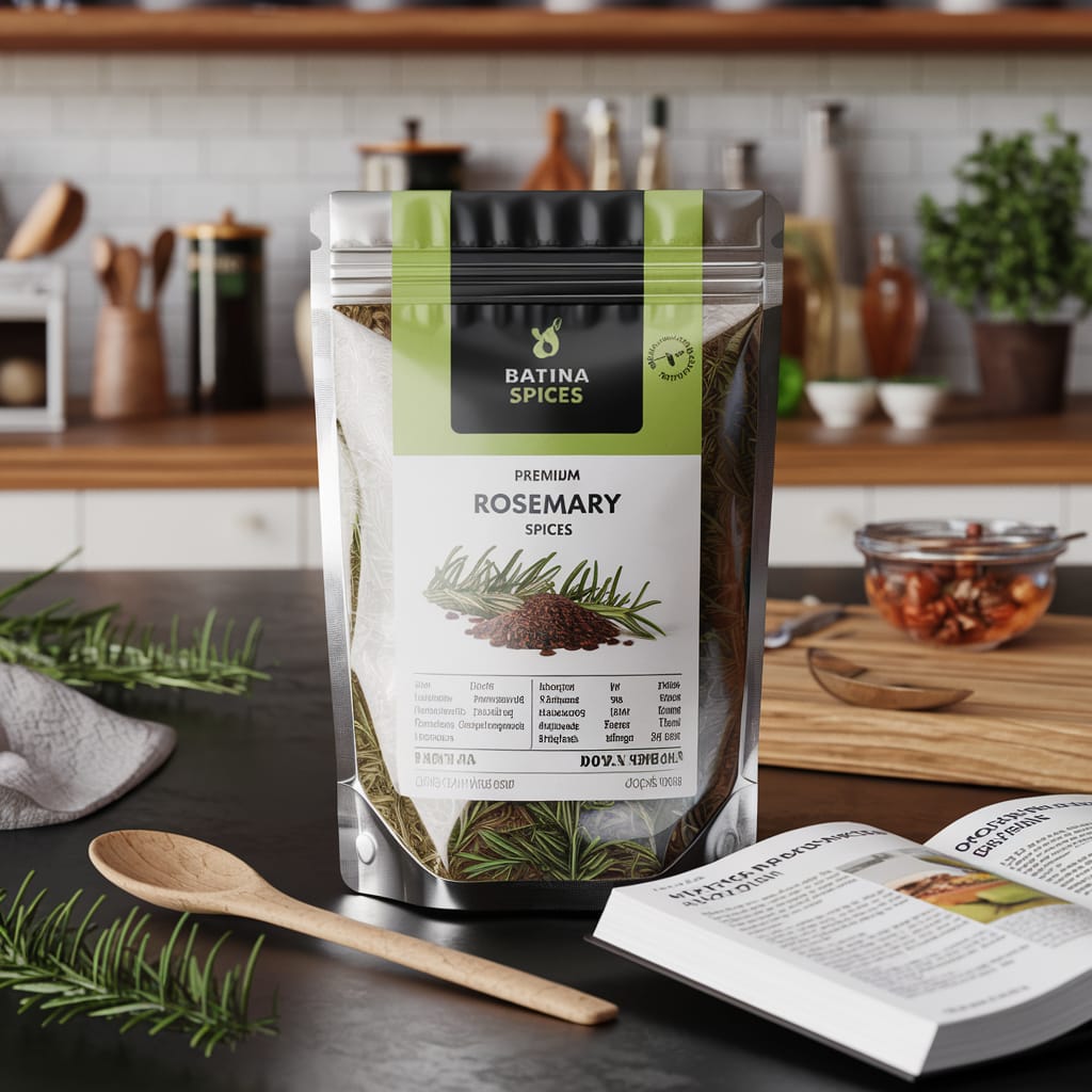
2. Thyme Spice Label Design
The Thyme Spice label captures the essence of this aromatic herb with a fresh and vibrant design. The label uses shades of green to represent the freshness of thyme, complemented by a clean and modern font. The minimalist design ensures that the label is not only visually appealing but also easy to read, making it perfect for any kitchen setting.

Thyme is a versatile herb that is used in a variety of cuisines around the world. Its fresh, earthy flavor is a staple in many dishes, from soups and stews to roasted meats and vegetables. We wanted the label to reflect this versatility and freshness.
The green color palette was chosen to represent the natural, organic qualities of thyme. Green is often associated with health and vitality, making it the perfect choice for a herb that is known for its fresh, vibrant flavor. The clean, modern font complements the minimalist design, ensuring that the label is both stylish and functional.
To add a touch of elegance, we incorporated a subtle leaf pattern into the background. This pattern is inspired by the shape of thyme leaves and adds a layer of texture to the design. The overall effect is a label that is both visually appealing and reflective of the product’s natural qualities.
Functionality was also a key consideration in the design process. The label is designed to be easily readable, with clear, concise text and a simple layout. This ensures that consumers can quickly identify the product and its key features, making it a practical addition to any kitchen.
3. Oregano Spice Label Design
Our Oregano Spice label is inspired by the Mediterranean origins of this beloved herb. The design features a mix of green and earthy tones, reflecting the natural and organic qualities of oregano. The label’s typography is sleek and contemporary, ensuring it catches the eye while maintaining a professional look.
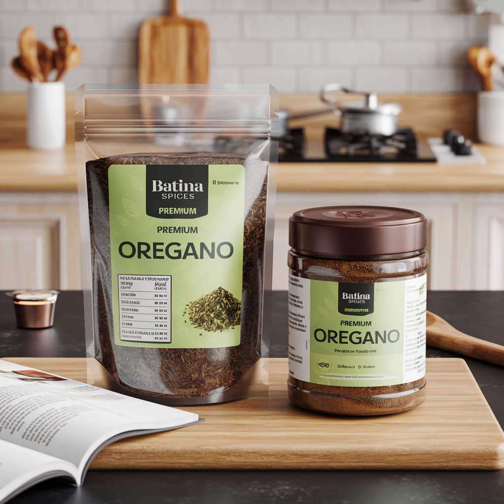
Oregano is a staple in Mediterranean cuisine, known for its bold, aromatic flavor. We wanted the label to reflect the rich culinary heritage of this herb, while also appealing to modern consumers. The green and earthy tones were chosen to represent the natural qualities of oregano, while the sleek typography adds a contemporary touch.
The design process began with researching the cultural and culinary significance of oregano. We wanted to create a label that not only looked good but also told a story. The earthy tones were inspired by the landscapes of the Mediterranean, while the green hues represent the freshness and vitality of the herb.
To add depth and interest to the design, we incorporated a subtle pattern of oregano leaves into the background. This pattern adds texture and visual interest without detracting from the main text. The overall effect is a label that is both stylish and reflective of the product’s natural qualities.
Functionality was also a key consideration in the design process. The label is designed to be easily readable, with clear, concise text and a simple layout. This ensures that consumers can quickly identify the product and its key features, making it a practical addition to any kitchen.
– The Importance of Label Design in the Spice Industry
Label design plays a crucial role in the spice industry. A well-designed label not only attracts consumers but also communicates important information about the product. In a crowded market, a standout label can make all the difference.
For our spice labels, we focused on creating designs that are both visually appealing and functional. Each label is designed to reflect the unique qualities of the spice, while also ensuring that key information is easily accessible. This balance of aesthetics and functionality is essential for creating labels that stand out on the shelf and resonate with consumers.
– The Design Process
Creating these spice labels was a collaborative process that involved extensive research, brainstorming, and iteration. We began by researching the cultural and culinary significance of each spice, as well as current trends in label design. This research informed our initial concepts and helped us create designs that are both relevant and appealing.
Next, we brainstormed ideas and created rough sketches of our concepts. This stage allowed us to explore different design directions and refine our ideas. Once we had a clear vision for each label, we moved on to the digital design phase.
In the digital design phase, we created detailed mockups of each label. This involved selecting color palettes, typography, and graphic elements that would bring our concepts to life. We also experimented with different layouts and compositions to ensure that each label was both visually appealing and functional.
After creating the initial mockups, we reviewed and refined our designs. This involved making adjustments to the color palette, typography, and layout to ensure that each label met our high standards of quality and design excellence. We also tested the labels on different types of packaging to ensure that they looked good and were easy to read in various contexts.
– Final Thoughts
We are incredibly proud of our latest spice label designs and believe they will make a strong impression on our potential clients. These labels are a testament to our commitment to quality and design excellence, and we hope they will add a touch of elegance and organization to any spice collection.
Whether you’re a home cook or a professional chef, these labels are designed to enhance your culinary experience. We hope you love these designs as much as we enjoyed creating them. Stay tuned for more exciting projects and design updates!